
"It is
impossible for ideas to compete in the marketplace if no forum for
� their presentation is provided or available." �������� �Thomas Mann, 1896
PROCESS
CONTROL
Technique
for visualizing vast amounts of data to characterize the
process stability and
capability of meeting customer specifications.
Author: Darryl Dodson-Edgars
�
Abstract
The
mill information network forms the basis of a database that can be viewed in
many formats. The typical
conversion of a series of data points into a time trend is well known from the
days of strip charts and graphic trends on operator DCS displays.�
What do we do in order to understand the stability of a process or its
capability of producing a product that the customer will accept?� The underlying theory of viewing a histogram from a set of
data and noting its relationship to the specification limits expected by the
customer is understood.� For that
histogram, a capability index, Cpk, may be calculated, yet does
that tell us what is happening to that process with time?
This
paper describes a method of taking sequential sets of data, arranged into
rational subgroups, and converting each subgroup into its corresponding
histogram.� The histograms are then transformed from the normal� X-Y
bargraph into strips of color based upon the value of the histogram count for
each of the incremental bins.� The strips of color for each histogram are
then stacked vertically on the page to form a rectangular region on the
screen.� Care is given during the procedure to assure each histogram is
counted over the same range of values.� The customer specification limits
are arranged to the left and right of the rectangle.� The picture now
represents the evolution of the process over substantial periods of time.�
The patterns formed immediately communicate the nature of the process
behavior.� Examples will be shown indicating the expected
"normal" well behaved process and the kind of patterns associated
with processes that have drifting means, common and special cause deviations
from the customer expectations.� The methods useful in comparing
subgroups with varying size will be discussed.� The implications of the
normalization procedure lead to the interpretation of the pictures as
"Sigma-plots", wherein the color bands give the behavior of the
standard deviation with time.
Introduction
The process
industries make use of measurements to control and understand the nature of
their production.� These
measurements each have ranges over which their readings are valid.� A level measurement could likely be anywhere over the full
range.� A measurement of
consistency likewise has a range of operation, but in this case the object is
to keep the value of the consistency at some particular setting.�
If the control system is designed, installed, tuned and maintained in
good condition, the objective can be achieved.�
When some aspect of the system changes, adverse effects can limit the
ability of the control system to do its job.�
The variability in the process directly limits our ability to meet the
specifications required.� This
discussion will describe a method of organizing processed information from
rational subgroups of raw measurement data into images.�
These images are able to convey a significant insight about the
long-term stability of a process and the capability of maintaining the
required specifications.� Pictures
of actual data are presented to illustrate various distinct patterns.
Discussion
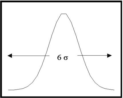 Variability
is a fact with which we all are familiar.�
The�� process control world is based upon the measurement
of�� something, in order to decide what to do in the future
to�� maintain or adjust a process in some particular manner.��
The inherent unsteadiness of the measurement world is�� based
upon both sensor noise and changes in the process�� under
observation.� The Mathematics’
that describe the�� measurement variability assumes that the
variation is�� normally distributed around some mean value.�
This is�� shown in figure 1.�
The width is parameterized by the standard deviation, s.�
The normal distribution is 6s
wide.� That is to say, we can
expect to find 99.7% of the measurements within plus or minus 3s
of the mean value. Distributions of real
data form histograms that have the basic shape of the normal distribution for
many of the processes in the paper industry.� The most obvious deviation from this case occurs when the
process has changes in the mean value.� Human
beings induce such changes for deliberate reasons in the course of using the
process control systems.
When you set
out to observe the ability of your control system to maintain the process at
the desired state, the first question raised is “over what range of time to
observe the measurement”.� The
term “rational subgroup” describes the result of a logical thought process
that can follow several paths.� The
bottom line is to determine the data to translate into a histogram.� We may only want to do this one time.� On the other hand, it is likely that we want to observe a
process on a continuous basis.� In
that case, we need to gather data for a fixed period.�
This data gets assigned to the time range of the rational subgroup.�
The next data is gathered and assigned to the following time range, and
so on.� We can now observe the
consecutive histograms and begin to understand the longer-term nature of our
process.� Does it change from one
time interval to the next?� Does
the shape of the distribution change?.� Does the mean value drift around?� Are there more than one definite peak values?�
Answers to each of these questions would tell us something definite
about our process.
 The
paper industry serves a wide range of markets.�
Tissue�� customers want a product that is different than
Kraft bag�� material.� Newsprint
is different from photo-copy paper.��
Each grade of paper must conform to certain specification��
limits.� These limits are referred
to as the Lower
&
Upper��
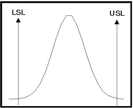
Specification Limits (LSL & USL).�
Figure 2 is a diagram�� showing a histogram distribution from
a normal process�� and customer specification limits.�
In this case, the�� process distribution is contained within
the limits for the�� specified measurement.�
This distribution could, for�� instance, represent the
variability in the brightness of the pulp, the consistency of the stock, or
the basis weight.� Any measurement
in the process that must conform to specification limits can be viewed in this
manner.
When a
process is able to be maintained within these specification limits, it is
thought of as being capable of satisfying the customer.� This has been mathematically defined as parameter Cpk,
known as the Capability
Index.� This index is the
measure of how completely the distribution lies within the limits.�
The equation that expresses this value is given by the smaller
of:
�����������������������
![]() ����� or��������
����� or��������
![]()
 This
equation assesses the compliance of the observed�� process to the
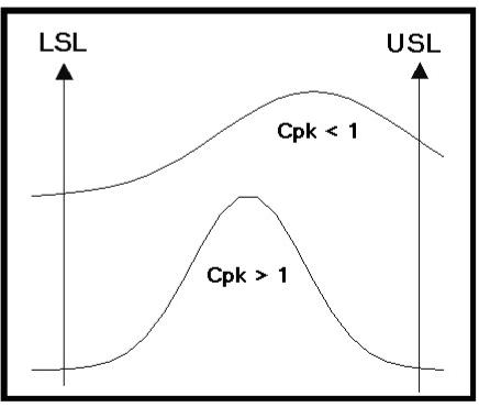
specification.� The Cpk
value will be greater�� than 1 for processes that are capable of
fully meeting the�� specification.�
Tighter distributions within the specification�� range lead
to higher calculated values of the capability�� index.�
Figure 3 shows two different distributions.�
The�� upper distribution would be from a process that is not
fully�� capable of meeting the required specifications.�
It would�� have a value of Cpk less than 1.�
The lower distribution is�� contained within the limits and
therefore would represent a�� satisfactory process with a Cpk
greater than 1.
The
histograms discussed thus far have been from a single sample period for a
process.� What happens with time?�
The paper mill is run around the clock for most of the year.�
How does the process evolve?� The
variation of measurements associated with the paper machine in the machine
direction (time) can be viewed from the perspective of both their short-term
(MDS) and long-term (MDL) behavior. The stability
of a process can likewise be considered for the short-term (within the
subgroup for a single histogram) and the long-term (among consecutive
histograms).� For instance, if the
measurement data subgroup was from a reel of paper, what are the relationships
of the histograms from different reels?� If
the histograms were lined up according to time, would any patterns emerge to
aid understanding the process dynamics?
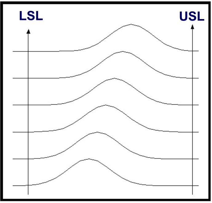
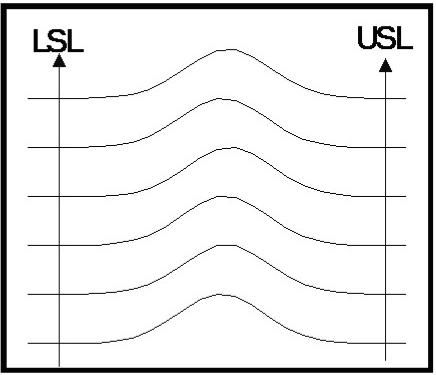 Figure
4. shows the histograms from six consecutive�� subgroups.�
This image characterizes a process that is�� maintaining a
stable mean value and has more than full�� capability of controlling
the process, with the tails of the�� histograms inside the
specification limits.� The
distribution�� of measurements are very similar from run to run.� This is�� the ideal situation.�
A process such as this lends itself to�� opportunities for
economic optimization.� For
instance,�� adjusting costly additives to keep the process
within�� specification but with the mean value shifted
appropriately�� to your advantage.
�
 Other
patterns in the histograms can become evident.���
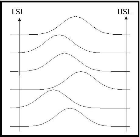
Figure 5 demonstrates another behavior.�
The operator of a�� process may want to adjust the mean, or set point,
of a�� process from one value to another.�
Normal operations�� often require changes in the set point.�
The patterns to�� expect would show an offset in the mean
value from�� histogram to histogram.�
The change can happen quickly�� or slowly.� The eye can easily note the shifting patterns.���
This shift will occur until the process has reached the new��
operating level.� The image would
then return to the steady�� state from figure 4 but with the mean
now shifted.
�
 Figure
6 is a different situation.� We
can see that the tails�� of all the distributions are within the
control limits.� That��
means the process remains capable of meeting the�� customers
specification.� The problem: the
mean value of�� this controllable process is drifting around in
the�� specification range without any noticeable pattern.�
The net�� effect of this kind of behavior will be that your
customer will�� perceive your process as having an overall wider
variability�� than you know to be the case.�
The variability from�� subgroup to subgroup will give the
impression that the�� variability is wider.�
Is this OK?� The hint to
take for the�� conscientious operator would be to determine why the
drift is occurring and do something about it.�
In some cases, this may be perfectly acceptable.�
It is more often the case that the customer’s process has a more
difficult time coping with your product because the properties change around
too much.� The modern machinery in
use today continually require narrower specifications.�
A situation like figure 6 would be out of tolerance sooner than
necessary, unless the mean value would stabilize and be shifted to the center.
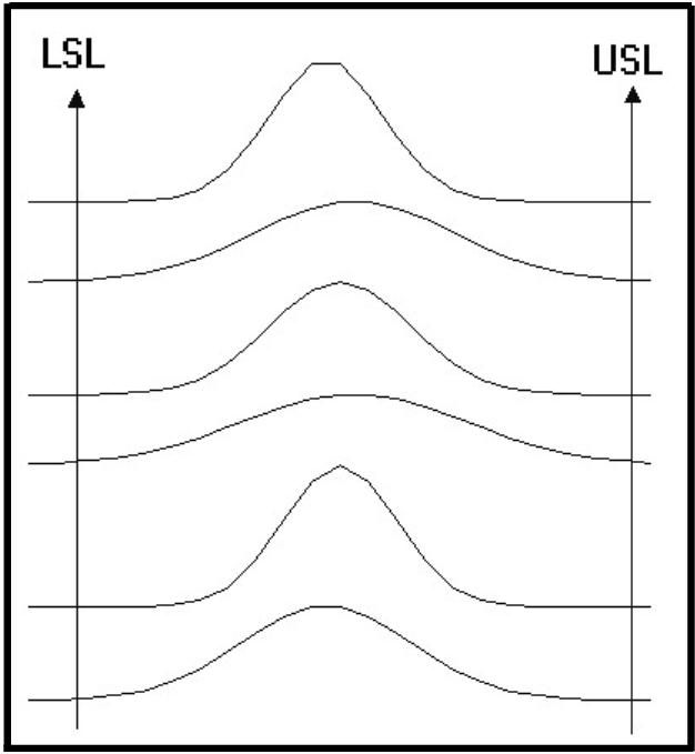 Another
process could have changes in the distribution��� from narrow to wide,
centered on a stable mean value.���
Figure 7 demonstrates this.� The
pattern could indicate a��� difficulty with the control system.�
Tuning changes would��� alter the width of the measurement
histogram.� Attention���
to details would be warranted to get back to the more��� ideal�state.
�
�
�
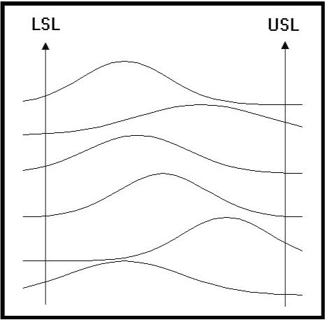 Figure
8 will drive your customer away.� The
manufacturing�� operation with a wild process like this will find it
difficult to�� compete.� The
mean is shifting, and the width of the�� distributions are changing.�
This is a picture of Chaos.��
Where do our process systems measure up to this form of��
scrutiny?� We may have an
intuitive idea about what we�� have.�
Human intuition has proven to be uncannily�� accurate.�
Despite this, you can not run a business only�� upon this
intuition.�
�
The process
control systems in use today are bountiful�� sources of information.�
Many industries have implemented process information systems that
gather and archive measurement information from their control systems.�
Data by itself is neutral.� We
have converted data into information for many years.�
One of the common methods of data conversion is with the time trends.�
The trends are a two dimensional history of a measurement (y-axis) with
time (x-axis). �In the early days it was done with ink on paper.�
Now we have high tech CRT’s and computers.�
Information about a process can convey more intelligence about a
process when presented in more than two dimensions.
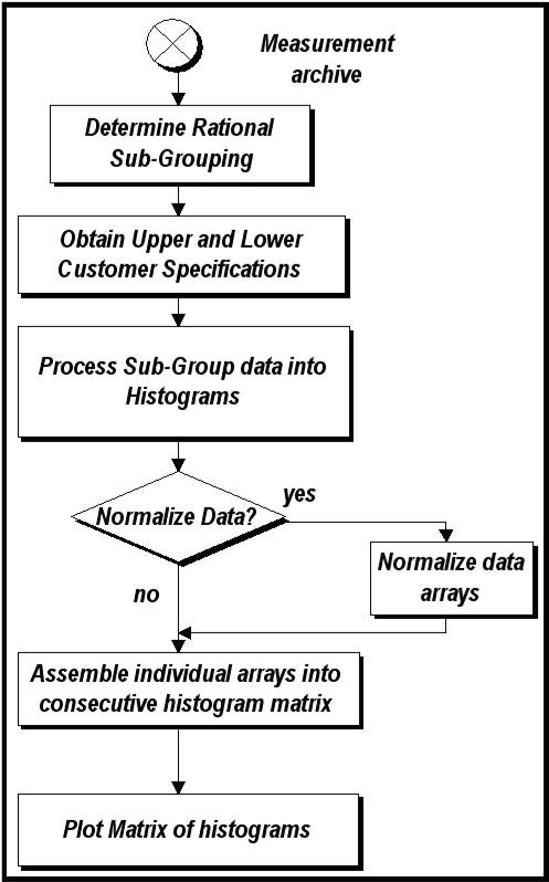 We
can choose to manipulate the data in�� our process measurement
archive in�� order to transform it into the kind of��
diagrams discussed above.� Figure
9�� shows a flowchart of the main operations.��
As this procedure is formulated for a�� particular
measurement several�� considerations must be attended to.�
This�� may best be understood by tracking an��
example measurement.� Let’s
convince�� ourselves that gathering a data point�� every
five minutes for the period of 24�� hours will give us reasonable
subgroup.�� This gives us a
data set made up of 288�� samples.�
Next we need to obtain the�� specification limits.�
We can then easily�� compute the histograms for
consecutive�� 24 hour periods.�
In the case where the�� subgroups contain the same number
of�� data points we can directly compare one�� histogram
to the next.� What if we were�� looking at a measurement on the
paper�� machine and the source of data had been�� the
scanning platform?� This is where the�� amount of initial data can
become�� immense.� It is
not uncommon to have�� the production reels consist of
different�� numbers of scans of the sheet.�
Each�� scan can consist of 100 individual��
measurements.� The number of scans
can be 150 during the manufacturing of the reel.�
That makes each reel contain on the order of 15,000 individual data
values.� The reel is a natural
subgroup candidate for the paper machine.�
In this case, we can normalize the individual data groups by assuring
that they all have the same area under the histograms.�
This is a simple procedure.� The
histogram with the most data samples becomes the benchmark.�
A different scaling factor is multiplied with each of the other
histograms to make the sample sets equal in size.�
This makes their area the same.� Other
manners of normalization will be useful in the transformation of the neutral
data into the intelligence we seek.
We
can choose to manipulate the data in�� our process measurement
archive in�� order to transform it into the kind of��
diagrams discussed above.� Figure
9�� shows a flowchart of the main operations.��
As this procedure is formulated for a�� particular
measurement several�� considerations must be attended to.�
This�� may best be understood by tracking an��
example measurement.� Let’s
convince�� ourselves that gathering a data point�� every
five minutes for the period of 24�� hours will give us reasonable
subgroup.�� This gives us a
data set made up of 288�� samples.�
Next we need to obtain the�� specification limits.�
We can then easily�� compute the histograms for
consecutive�� 24 hour periods.�
In the case where the�� subgroups contain the same number
of�� data points we can directly compare one�� histogram
to the next.� What if we were�� looking at a measurement on the
paper�� machine and the source of data had been�� the
scanning platform?� This is where the�� amount of initial data can
become�� immense.� It is
not uncommon to have�� the production reels consist of
different�� numbers of scans of the sheet.�
Each�� scan can consist of 100 individual��
measurements.� The number of scans
can be 150 during the manufacturing of the reel.�
That makes each reel contain on the order of 15,000 individual data
values.� The reel is a natural
subgroup candidate for the paper machine.�
In this case, we can normalize the individual data groups by assuring
that they all have the same area under the histograms.�
This is a simple procedure.� The
histogram with the most data samples becomes the benchmark.�
A different scaling factor is multiplied with each of the other
histograms to make the sample sets equal in size.�
This makes their area the same.� Other
manners of normalization will be useful in the transformation of the neutral
data into the intelligence we seek.
�
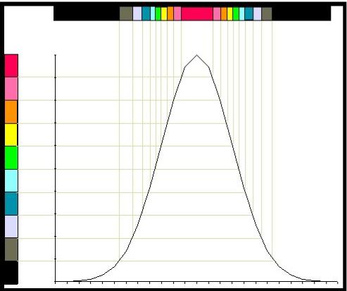 It
becomes evident when we want to look at�� more than few consecutive
histograms that the�� pictures shown above will get overcrowded
and�� difficult to read.� The
two dimensional plot of�� the histogram can be compressed into a
one�� dimensional strip of color.�
This transformation�� is given in figure 10.�
The preferred method is�� to use color.�
The use of gray scales will work�� but will lack the vibrancy
of color.� The Y-axis��
in figure 10 is divided into 10 equally spaced�� colors, arranged in
whatever manner appeals�� to the viewer.� The data for the histogram is�� then converted to
the color associated with the�� its position on the Y-axis.��
�
�
 The
normal distribution then maps into the�� strip of color (or grays).�
This procedure then�� allows the vertical stacking of many
individual�� strips that correspond to the consecutive��
histograms.� The mapping can be
done in�� many different ways to achieve different��
interpretations of the images.� When
the data�� from the individual histograms have been��
normalized so that the peak value of each�� histogram has the same
maximum value, the�� nonlinear mapping given in figure 11 then
leads�� to the interpretation of the images as “Sigma��
Plots.”� This mapping has the
upper color�� corresponding to the 60.7% to 100% range, the next
color corresponds to the 13.5% to 60.7% range, the third color corresponds to
the 1.1% to 13.5% range and the last corresponds to the 0% to 1.1% range.�
These values are the normalized amplitude of the Gaussian (normal)
distribution at the 1, 2 and 3 sigma points.�
The obvious interpretations of the color bands on the transformed color
strip are for the +/- 1 sigma, +/- 1 to 2 sigma and the +/- 2 to 3 sigma bands
around the mean.� Notice that they
are linear in the transformed strip domain.
The
normal distribution then maps into the�� strip of color (or grays).�
This procedure then�� allows the vertical stacking of many
individual�� strips that correspond to the consecutive��
histograms.� The mapping can be
done in�� many different ways to achieve different��
interpretations of the images.� When
the data�� from the individual histograms have been��
normalized so that the peak value of each�� histogram has the same
maximum value, the�� nonlinear mapping given in figure 11 then
leads�� to the interpretation of the images as “Sigma��
Plots.”� This mapping has the
upper color�� corresponding to the 60.7% to 100% range, the next
color corresponds to the 13.5% to 60.7% range, the third color corresponds to
the 1.1% to 13.5% range and the last corresponds to the 0% to 1.1% range.�
These values are the normalized amplitude of the Gaussian (normal)
distribution at the 1, 2 and 3 sigma points.�
The obvious interpretations of the color bands on the transformed color
strip are for the +/- 1 sigma, +/- 1 to 2 sigma and the +/- 2 to 3 sigma bands
around the mean.� Notice that they
are linear in the transformed strip domain.
Up to this
point, the discussion has been theoretical or hypothetical.�
We still have not seen how a real process could appear.�
The next six images are selected from actual data.�
The subgroups were the data from individual paper machine reel
measurements.� The data were
sorted by grade.� The data
represents three months of operation for a specific grade of paper.�
Specific patterns were then selected in order to demonstrate the
different types of image patterns that could be seen.
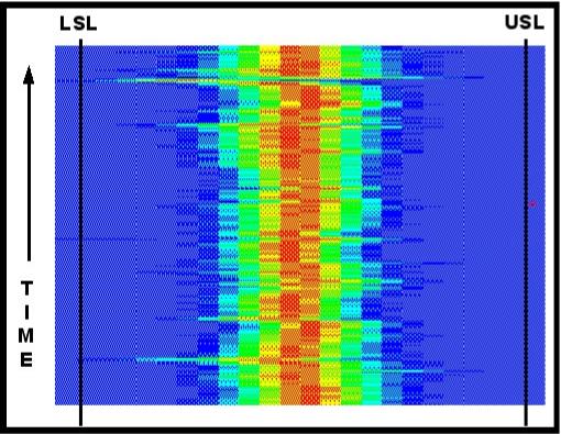 Figure
12 represents the transformed�� histograms from more than three
hundred�� individual reels of paper.�
Each subgroup�� contained more than 100 passes of
the�� scanner over the sheet of paper during its��
manufacturing.� Each pass of the
scanner took�� over one hundred measurements.� The picture�� then represents the interpretation of
nearly�� 3,000,000 measurements.�
Specification limits�� are shown along the left and right of
the figure.�� The pattern is
typical of the well functioning�� process.�
The mean value of the distribution is�� maintained in the
center of the specification�� limit range.�
The width of the spread of the histograms is well within the limit
range.� Reel after reel, grade run
after grade run, the process remains where it should.�
The event indicated near the upper left in figure 12 indicates a brief
shift in the mean.� This shift was
rapidly corrected and the process returned to the centerline.�
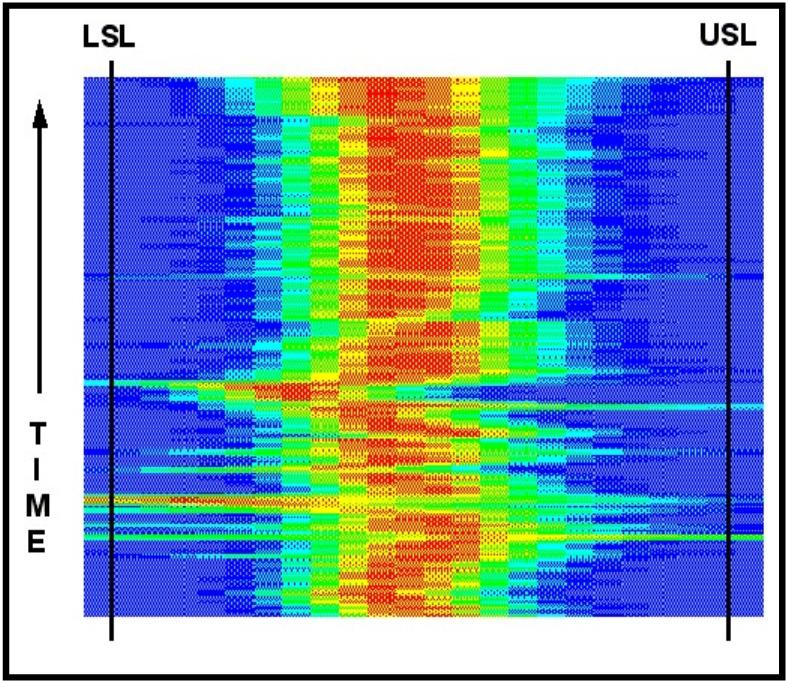 Figure
13 demonstrates the situation where a�� process mean was shifting in
an erratic�� manner for half of the run.�
The cause of the�� erratic operation, whether control,
machine,�� process or human related was stabilized with��
the result the eye can immediately perceive.���
The upper portion of figure 13 is much the�� same as figure
12.� The conclusion one could��
reach from figure 13 is that we are in good�� shape with this
process now.� We have the��
ability to keep the average process�� measurement in the middle of
the specification�� range.� Concentration
of effort can now be�� redirected to those parts of the process
where�� the picture indicates the need.
�
�
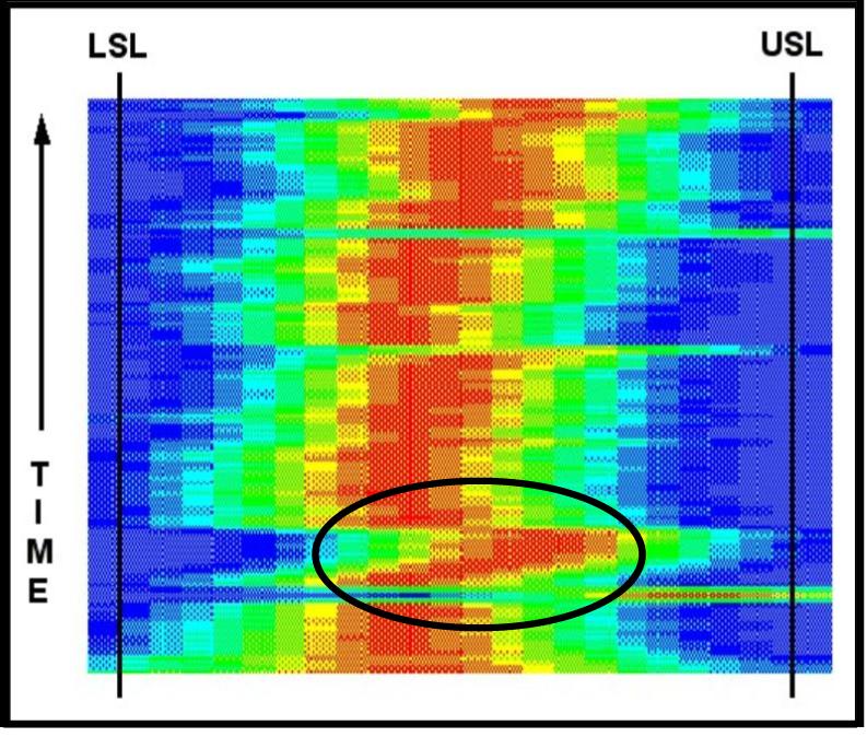 Figure
14 tells us something else.� The
first�� histograms at the bottom of the picture are��
wider than most of the other histograms.���
Changes were occurring that increased the�� inherent
capability of the process.� We can�� see that an event occurred where the
mean�� shifted significantly to the right and��
immediately corrected.� After the shift, the�� mean value of the next
several distributions�� was shifting to the right.�
This offset was then�� quickly reversed and the centerline
was re-� established.� Obvious
other transitions are�� noticeable between the consecutive
grade�� runs. �The
distributions are wider than those in�� figure 12.� This corresponds to the fact that this process in less
capable than the process for figure 12.� Nevertheless,
the customer specification was met except for the few special cause events.
�
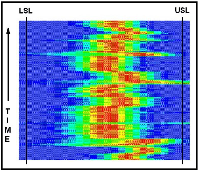 Figure
15 is a good example of run-to-run�� variability.� Each run consists of several reels.��� During each of these short runs, the mean�� value
is maintained at some point.� This
point�� does change though.� Is
this from different�� operators using their own preferred
settings?��� Is there a
shift in the process caused by other�� parts of the operation?�
Many questions will�� arise based upon the particular process
under�� observation.
�
�
�
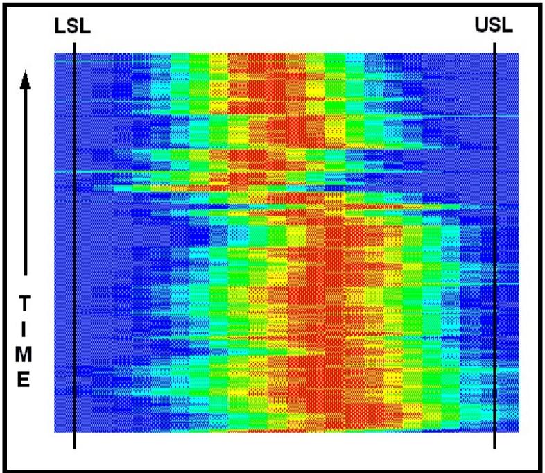 Figure
16 indicates the before and after for a�� process change.�
At the bottom of the figure,�� the mean is shifted to the
right and the width of�� the histograms was around two thirds of
the�� specification limits.� The
process was altered�� and afterward, the mean shifted down and
the�� width of the distributions decreased.��
The�� variability had decreased as predicted.��
This�� provides graphic evidence that the process
had�� been improved.� The
audience for� this�� perspective expands.�
The engineer who�� designed and installed the improvement to
the�� system can be certain of the project success.�
�
�
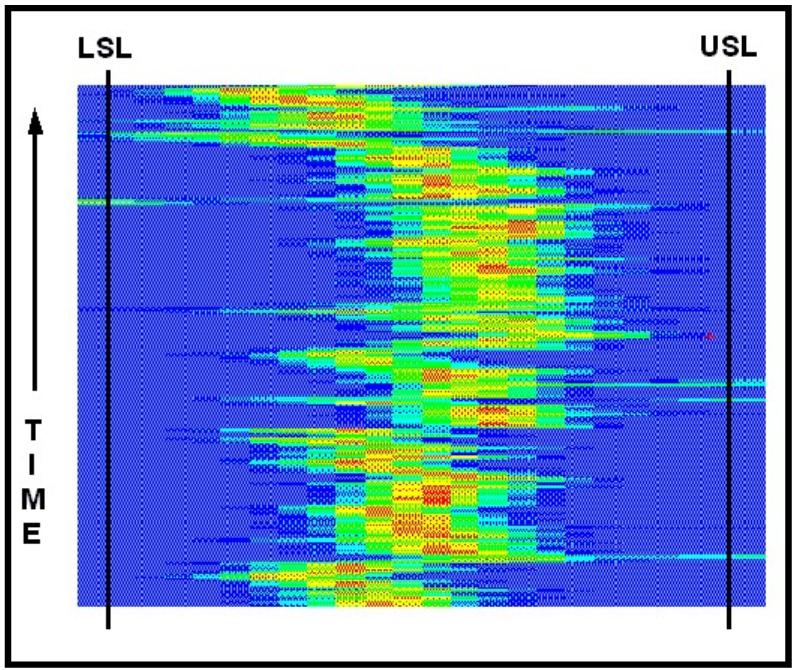 Has
figure 17 thrown us a curve?� Is
the�� movement of the mean along the variable path�� due
to things beyond our control?� Is
the�� adjustment to the process done for�� predetermined
reasons?� This picture should��
prompt dialog among the humans involved in�� the operation of the
process.� We either know��
what we are doing or we don’t know.�
�
�
Conclusion
We are
looking at the process is a way that has not been available in the past.�
We are seeing the process from a very different vantage point.�
This is the forest.� The
measurement from a single scan is the realm of information typically available
in the manufacturing environment.� We
are now looking at the historical path of our process dynamics.�
We can ask many questions and get the inspiration to consider subtle
aspects of the total operating system.� This
system incorporates the process, the machines, the computers, the people and
their practices.� Is the overall
operation giving our customers what they want?
Acknowledgment
The author
wishes to recognize the contributions of Dr. M. J. Coolbaugh in the
discussions about data normalization and Mr. J. Huff for his encouragement to
explore.
About the Author:
Mr. Dodson-Edgars founded
Dodson-Edgars Associates in April, 2001. He has over 25 years in information
technology, including development and implementation of several major
technology plans. He is the former Chief Technology Officer for Multivision,
Inc, one of two national video clipping services with offices in New York, Los
Angeles, Chicago and San Francisco. Mr. Dodson-Edgars was brought on-board to
move the fulfillment channel from overnight messengers to video streaming over
the Internet.
Prior to joining
Multivision, Mr. Dodson-Edgars served as the Chief Technology Officer of
Fed2U.com, an Internet company created to devise and implement the strategy in
delivering the new federal government information portal E-commerce website.
This fast-track site was brought from inception to launch in four months,
integrating the content of a dozen Federal web sites with political news
feeds. The subscription-based business-to-business target market included
lobbyists, law firms, and organizations seeking to automate mining the
governmental data sources.
Before his work at
Fed2U.com, Mr. Dodson-Edgars spent 15 years at Boise Cascade, the $6 billion
forest products company. During his tenure at this company he served in a
variety of technology roles, including the top Web and computer technologist
for the company. His extensive background in computer programming and process
engineering lead to national award-winning software applications.� He
pioneered the creation of Intranet and Extranet applications, which lead Boise
Cascade into receiving national recognition as the top manufacturing operation
poised to reap the harvest of true ERP.
While with Boise Cascade,
Mr. Dodson-Edgars also served as the chief technology officer and principal
investigator for DynaMetrix Corporation, a high-tech startup company
developing the commercialization of his patented technology under a Department
of Energy research grant.
After graduation, he spent
several years as a physicist at Naval Research Laboratories and with NASA at
Cal-Tech’s Jet Propulsion Laboratory. He has bachelor’s degrees from the
University of California at Irvine, where he graduate magna-cum-laude in
mathematics and physics. Under a fellowship from the Naval Laboratory he
pursued Ph.D. studies in engineering at the University of California, Los
Angeles.�
Visit the Authors Web Site
![]() �Click Here
for The Business Forum Library of
White Papers��
�Click Here
for The Business Forum Library of
White Papers��
![]()
�

 Search Our Site
Search the ENTIRE Business
Forum site.�Search includes the Business
Forum Library, The Business Forum Journal and the Calendar Pages.
The Business Forum, its Officers, partners, and all other
parties with which it deals, or is associated with, accept
absolutely no responsibility whatsoever, nor any liability,
for what is published on this web site.��� Please refer to:
Home��� Calendar��� The�Business�Forum�Journal���� Features��� Concept��� History
� Library��� Formats��� Guest�Testimonials��� Client�Testimonials��� Experts��� Search��
News�Wire����� Join Why�Sponsor���� Tell-A-Friend���� Contact The Business Forum
The Business Forum
Beverly Hills, California United States of AmericaEmail:� [email protected]
Graphics by DawsonDesign
Webmaster:� bruceclay.com
�
� Copyright The Business Forum Institute 1982 - 2009� All rights reserved.
�